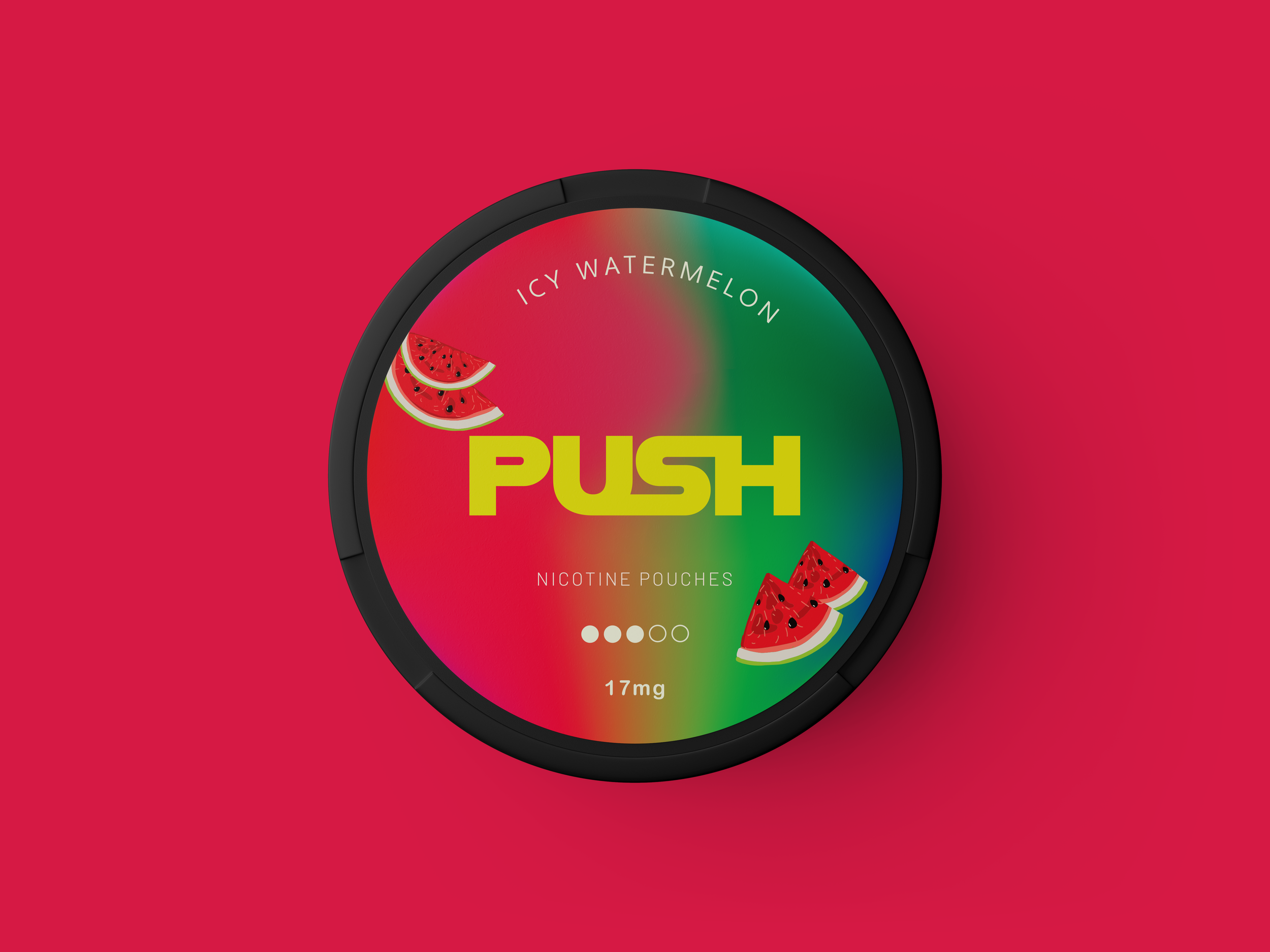
PUSH SNUSS
Project Type
Graphic Design
Media
Branding Identity & Packaging
Year
2024
Brand Attributes
Fresh | Impactful | Bold
Brand Identity
The visual identity of Push embodies energy, endurance, and modernity. The logo is bold and dynamic, reflecting the brand's focus on active lifestyles. The use of vibrant colors like electric blues, intense oranges, and deep reds creates a striking and energetic aesthetic. Incorporating sleek, athletic design elements and subtle references to the Brazilian landscape further solidifies the brand's connection to its essence. Push's identity is designed to resonate with those who thrive on movement and excitement, whether in the gym or at a party.
Client
Push is a nicotine pouch line designed for the Brazilian market, catering to athletes and party enthusiasts who seek to stay active and endure throughout their day. Each flavor is crafted to invigorate and energize, perfect for those who lead dynamic lifestyles. Based in Rio de Janeiro, Push stands for excellence and performance. The products are formulated with the highest quality ingredients to provide a smooth and satisfying experience.
Packaging
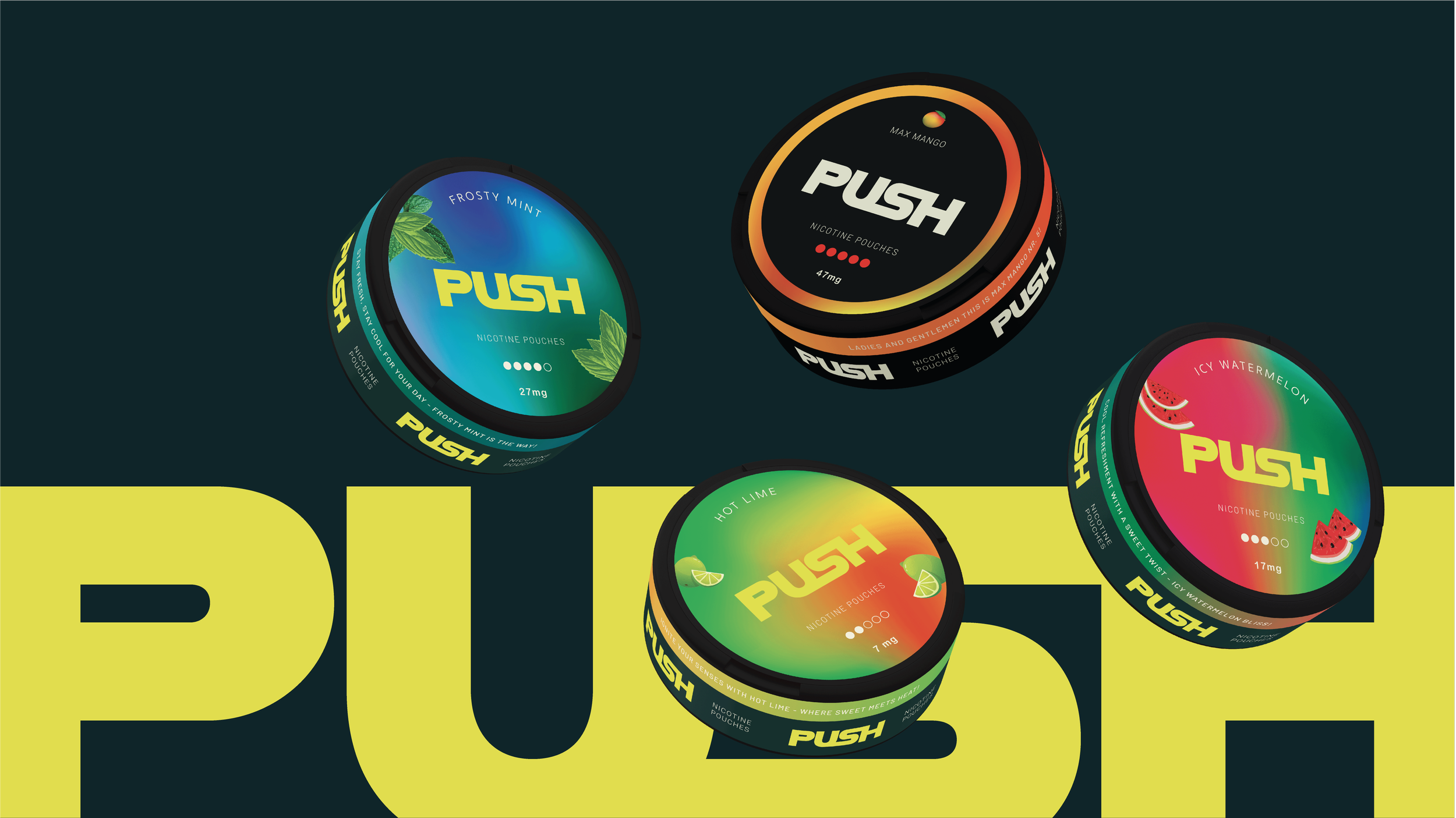
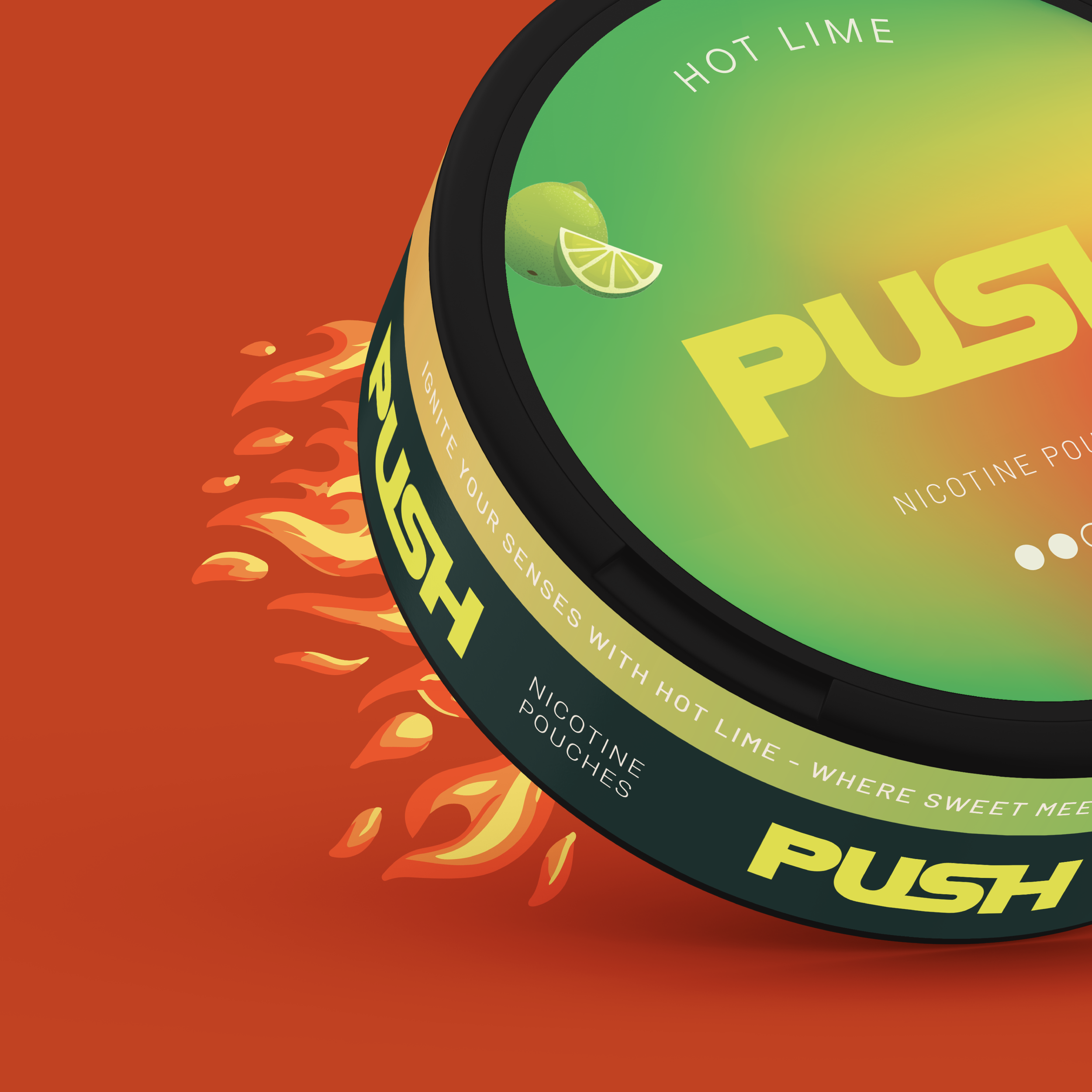
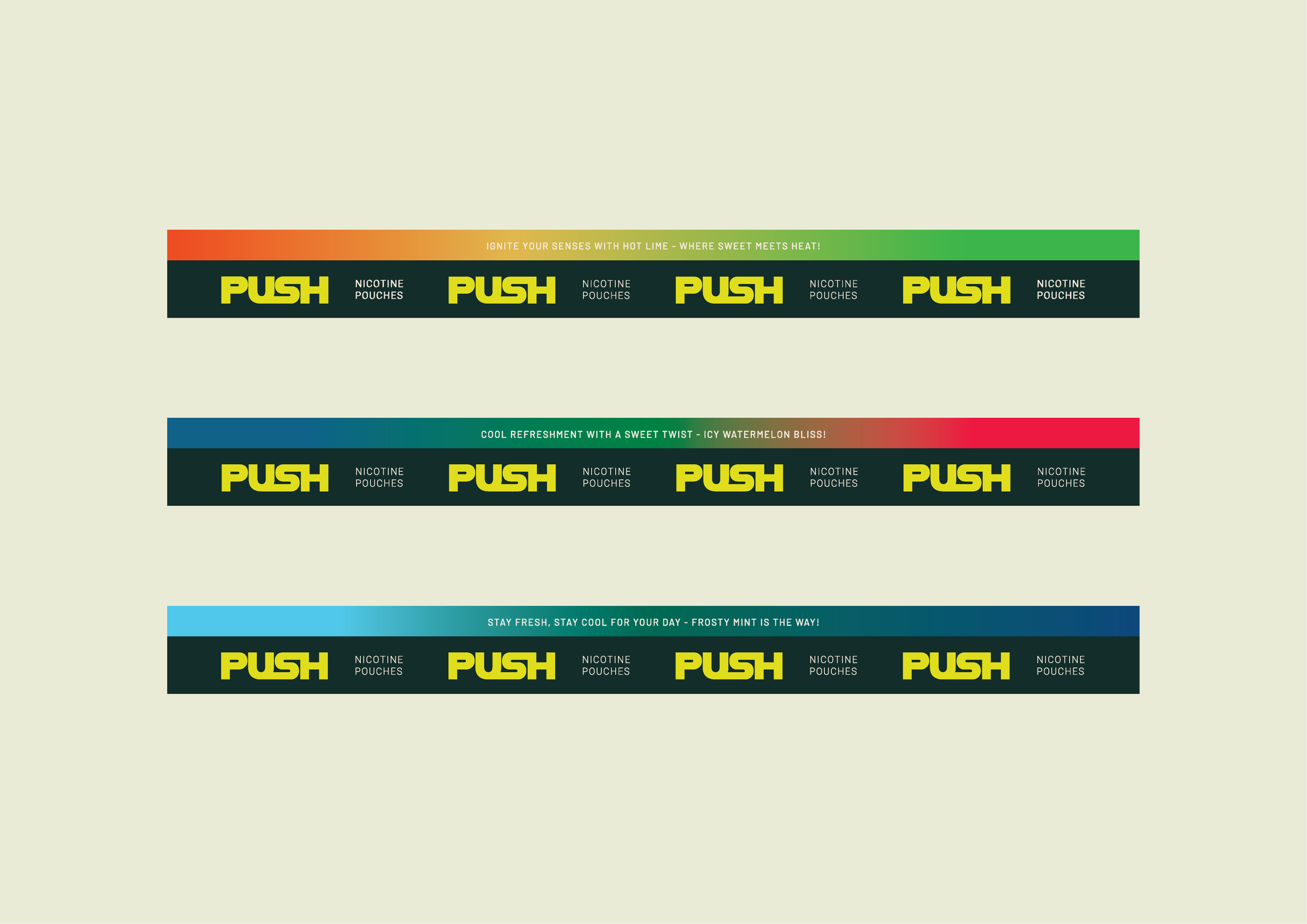
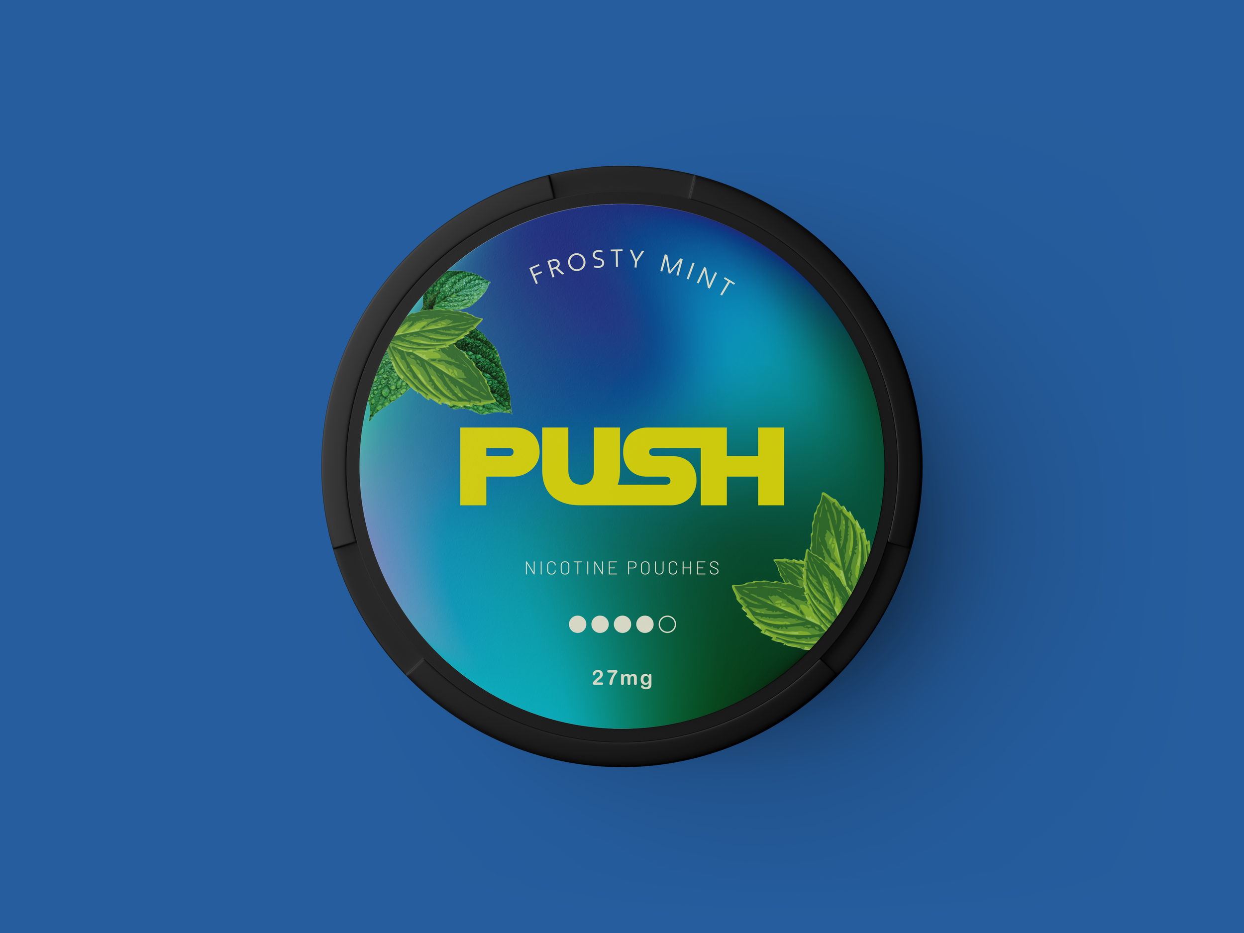
The Push nicotine pouches packaging design features a bold, modern aesthetic that captures attention through vibrant gradients and sleek typography. Each flavor—ranging from Frosty Mint to Hot Lime—is distinguished by its unique color palette and minimalistic illustrations, creating a strong visual identity for each product. The packaging balances gradients with a clean layout, using icons that intuitively communicate flavor profiles, while the bold "PUSH" logo anchors the design with a contemporary feel. Clear indicators for nicotine strength and descriptive taglines on the rim enhance the user experience, making the packaging both visually appealing and functional. This design approach not only ensures brand consistency but also creates an engaging product presence.

