Pop the Corn
Project Type
Graphic Design
Media
Branding Identity & Packaging
Year
2023
Brand Attributes
Bold | Vintage |Vibrant
Client
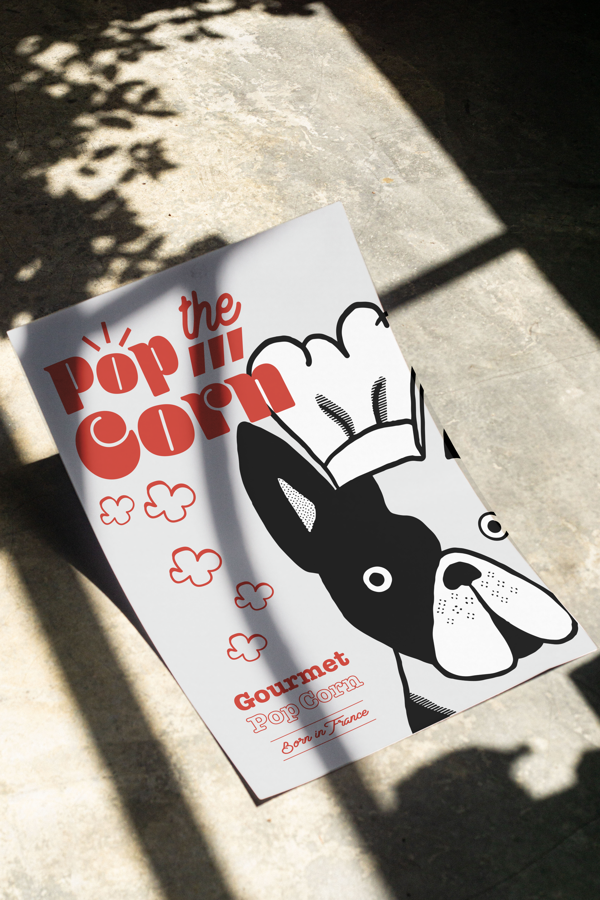
Pop the Corn is a deluxe and organic brand of popcorn made in France. It is made with the finest ingredients and has a range of symphony of flavours to choose from from classic buttery goodness to exotic truffle parmesan, savor every moment with our diverse flavors. The brand’s style needs to represent a joyful retro feel while also considering the gourmet identity of the brand.
Brand Identity
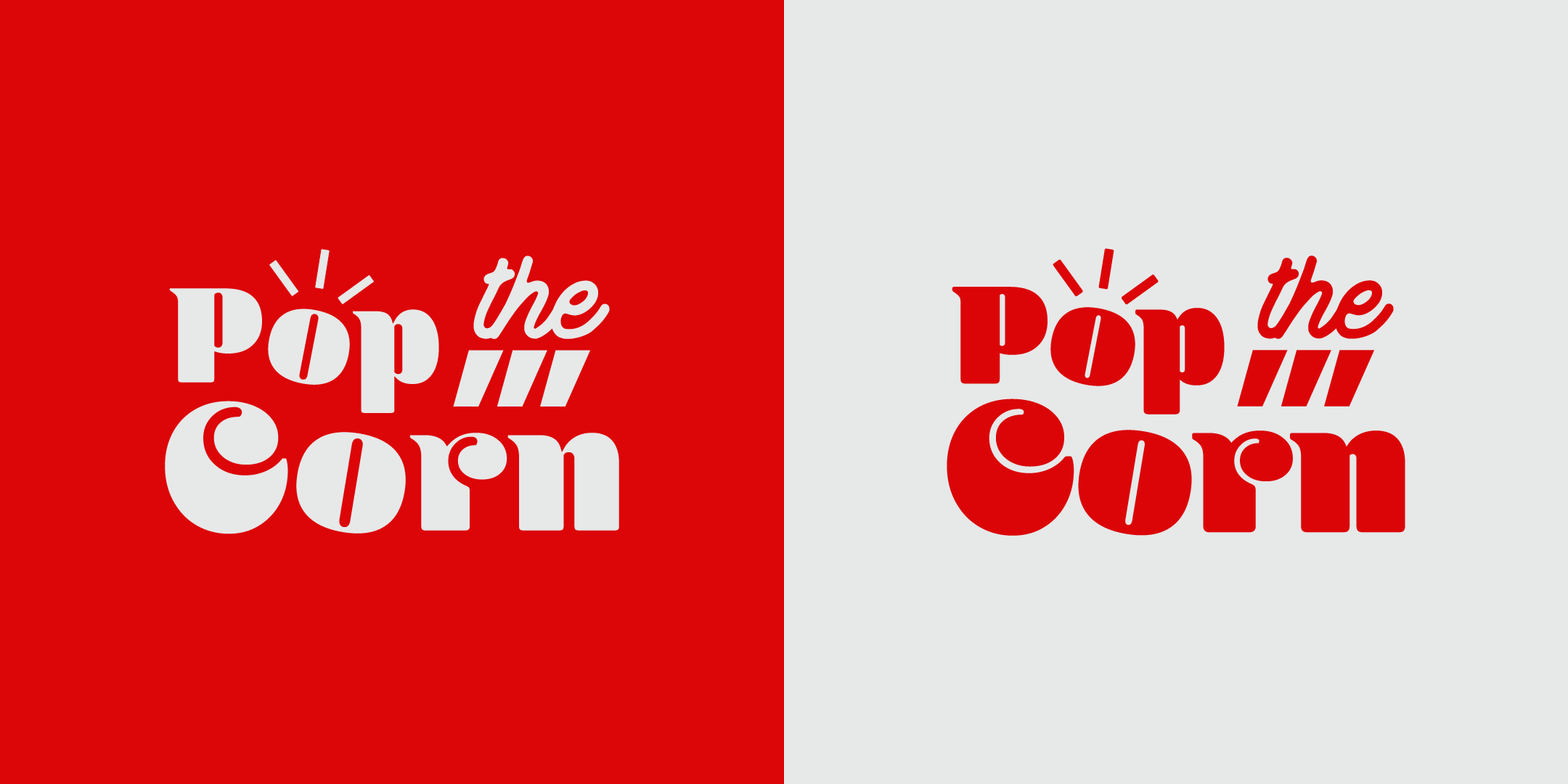
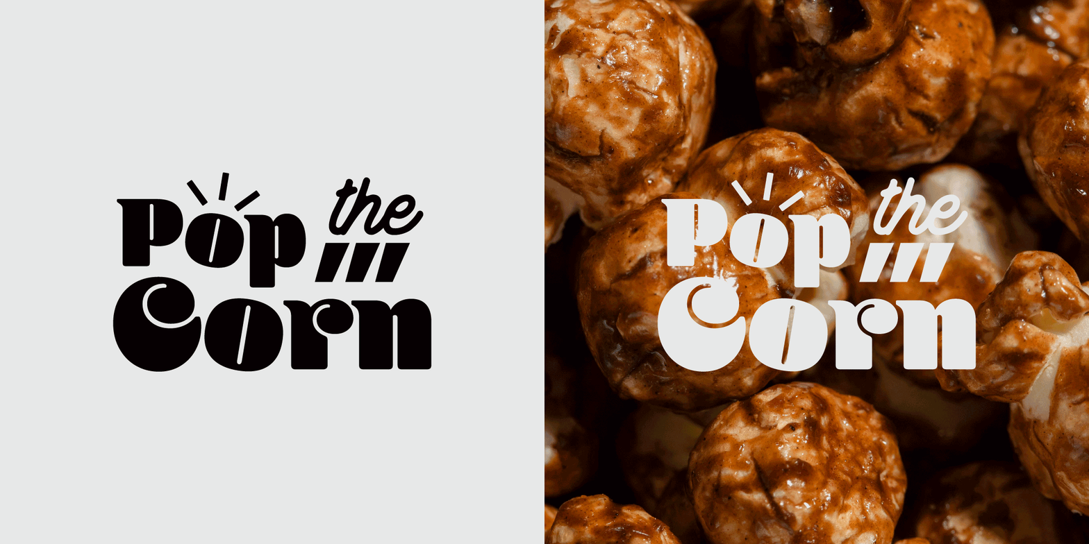
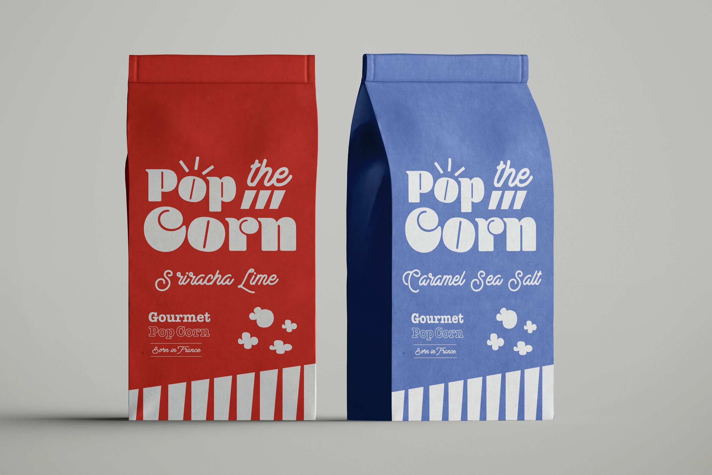
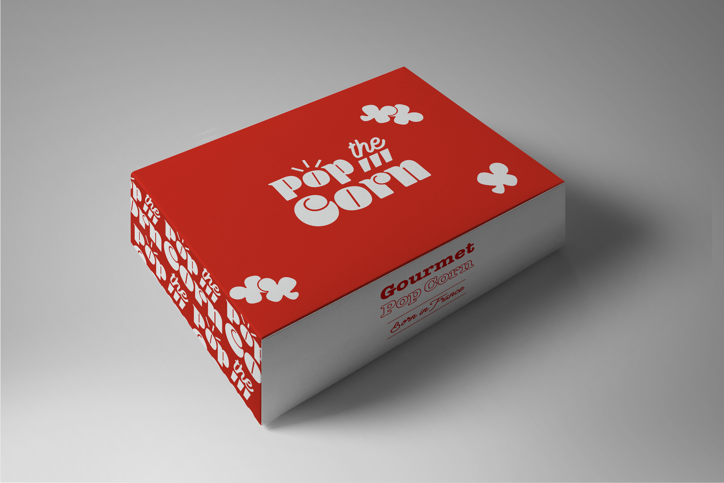
The brand identity is designed to convey a joyful retro feel while maintaining a sophisticated gourmet image. The packaging showcases vibrant colors and playful typography, evoking a sense of nostalgia and fun. The illustrations, featuring a charming dog chef, add a whimsical touch that appeals to both the young and the young-at-heart.
The use of bold, contrasting colors on the packaging, such as red and blue, highlights the premium quality of the product and ensures it stands out on the shelves. Each element of the design, from the retro fonts to the clean, minimalist layout, reflects the brand's commitment to quality and gourmet excellence, making "Pop the Corn" not just a snack, but a delightful experience.

